Analyse Your Sales Data
Understanding sales data, your guide to getting started with analysis and filtering

Analysis is designed to provide a deep dive into your historical sales data, offering insights through various graphs, data tables, and filters. This interface is your gateway to understanding sales dynamics, trends, and performance metrics across different dimensions of your business.
Graphs and Tables
The module features different ways to interact with the data, each designed to offer different perspectives on your sales data:
Overview: This section presents a granular, categorized view of sales data in a table format. Data is broken down by the dimension you've chosen (e.g., product, market, category) and compares it to your Budget and the Previous Year.
Sales data is broken into Processing (unfulfilled orders) and Completed orders, shown alongside sales from the previous year.
Graph: This composite section displays a smaller table summarizing key figures alongside two primary graphs:
Sales over time: This graph shows sales data over time (e.g., by month, week, or year). You can add additional data points like Margins, Returns, or Discounts to the graph for comparison.
Sales breakdown: This graph shows sales broken down by the same grouping you've chosen for the table (e.g., by product, market, category).
Time series: This view allows you to display two data points simultaneously (e.g., Sales and Margin) in a time series table. Metrics available include Sales, Margin, Returns, Ingoing stock, and Stock turnover, broken down by your chosen frequency (year, quarter, month, week, or day).
Stores: This view allows you to compare performance across your different store locations. The Like-for-Like comparison only includes stores that have been open since the start of the compare period (one year prior), allowing you to view purely organic growth by excluding newly opened stores.

Data visualisation options
Value or Units: Choose to view data as the currency defined for your account (Value) or as the total quantity sold (Units). Value shows your revenue metrics; Units shows volume.
Net or Gross Sales: Switch between Gross Sales (sales before returns) or Net Sales (sales after returns). Net Sales is generally the most accurate view of actual revenue.
Date Selection: Choose the context for the sales metrics. Select between Order dates (when registered), Delivery dates (when completed), or Invoiced dates (when billed).
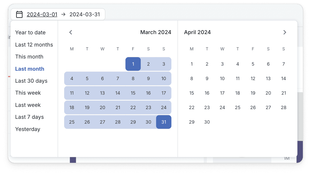
Choose the right time window
Before filtering, always confirm your desired time context using the date picker.
Locate the date picker at the top of the module.
Select a desired time window. Choose either one of the presets (e.g., Last Quarter) or a custom date range.
Manually enter the date or select it using the calendar picker.
Result: This selection instantly refreshes your data view to match the chosen time frame.
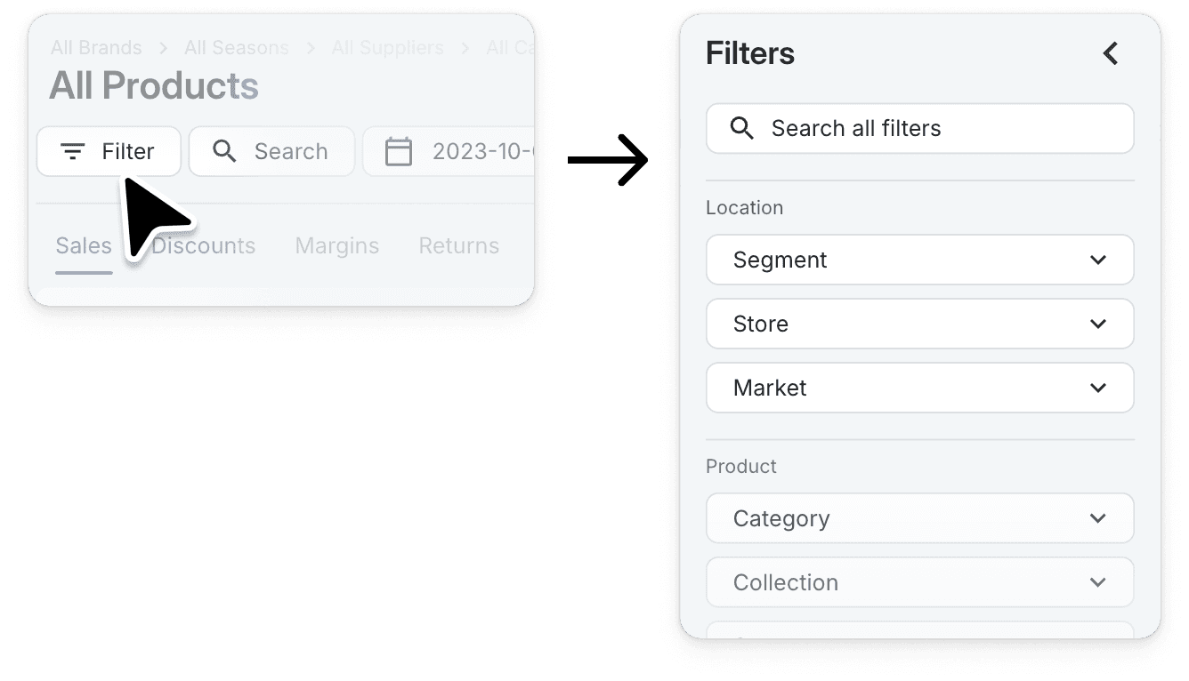
Deep dive with Filters
Filters allow you to isolate and focus on specific data segments (products, markets, locations, etc.).
Open the filter drawer on the left-hand side of the module.
Select the dimension you want to analyze (e.g., Category, Sales Market, or specific Products).
Apply the filters by selecting the relevant options.
Result: Applying filters immediately updates all graphs and tables to show only the data relevant to your selections.
Conclusion
This guide provides a foundation for exploring the analysis module and leveraging its capabilities to enhance your understanding of sales data. By customizing views, applying filters, and interpreting the various graphs and tables, you can uncover valuable insights to inform your business decisions.